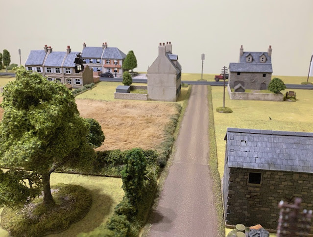
A new campaign for Chain of Command is always an excuse to make a few additions to the 20mm collection, be it miniatures or terrain. For this campaign, set in the Netherlands during 1940, my regular opponent Dave will be supplying the miniatures as he has an early war collection including a Dutch infantry platoon. That means my main contribution will be the terrain.
Nothing says the Netherlands quite like a windmill and in anticipation of this campaign I made one using the old HO/OO scale railway model from Dapol. Given most of my European buildings in this scale have a distinctly French look I'm hoping the windmill will go some way to give the table a little more Dutch character.
One other specific addition for this campaign are pillboxes, or Kazemat as the Dutch called them. From what I could gather many of these followed similar designs to those used in Britain in 1940 and I found a set in MDF made by Blotz that came very close to what I wanted. The kits were fairly basic and so I added external texture to make them look less like MDF kits. There's a more detailed look at how I did that in this post.
Front and back yards are distinctive features of houses in most European cities but I've wanted to avoid permanently attaching buildings to bases so that they can be used in different ways. For example many French villages have houses directly adjoining the street, while many Dutch houses have a small front yard. In preparation for the 29, Let's Go! campaign I made up several enclosed areas that could be placed at the front or rear of my houses.
These worked well and so for this campaign I wanted to add smaller front yards that would butt up against the road. I decided to take a modular approach so that they can be used in different ways and won't tie the houses to a specific base. From what I could discover some of the most common enclosures for these in the Netherlands are low brick walls and iron fencing. A great source of ideas and inspiration for terrain was the Operation Market-Garden book from publisher After the Battle. It's full of images from Eindhoven, Nijmegen and Arnhem and gives a very good idea of the look of 1940s Dutch towns and cities. Also worth noting that an Operation Market-Garden supplement for Chain of Command is due for publication very soon, which makes any investment in Dutch terrain very worthwhile.
So while the buildings continue to look French hopefully the front yards look a little more Dutch. Well, that's the theory anyway!
The base was made from MDF. The walls are MDF wrapped in wallpaper printed and embossed with bricks (you can see more about using this in this post). The iron railings come from a plastic set of town accessories from Italeri. Finally the flagstones for the pavement were made from cardboard.
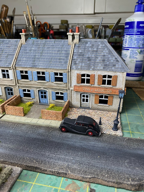
I made a very similar style of base for two of my larger buildings, with room for one residential building and an adjoining commercial premises. As you can see below this can be used to continue the row of houses or could be used in a different location.
The base was made in the same way as the previous, except this time I used wallpaper printed with a cobblestone effect to make an open area in front of the shop. The two bollards and the street lamp all came from the same Italeri set as the iron fencing for the terrace houses.
I've had a metal model of a village water pump and horse trough that I've been wanting to base for some time and the cobblestone paper gave me an idea to combine it in a modular way with a number of my trees that are based for urban street settings.
I had done something similar to create a park and war memorial in the town of Metgethen in East Prussia as part of the Konigsberg 1945 Westwind campaign and the trees had originally been created for that.
For this project I cut a piece of MDF to the same length as the tree base and covered it with the cobblestone wallpaper.
By combining all the various terrain elements they make a small village feature without creating a larger permanent piece that may have limited uses.
Despite all this, most of my buildings still look more at home in France than they do in the Netherlands. I had constructed and primed a building of a shop but it had been sitting on my shelf waiting for paint. It wouldn't take too much to make it slightly more Dutch in appearance than French. The first decision was to leave off the window shutters. Not that you don't see window shutters in the Netherlands, but they are not as common as they are in France. Other than that most of the changes were cosmetic. I painted the roof tiles in terracotta instead of slate, as that is certainly a common feature in Dutch houses. Next was to find suitable shop signage in Dutch and in this case we have De Gruyter's grocery store, a suitably ubiquitous type of business that will fit in any urban setting.
One thing that needed some consideration were the very large windows, they just didn't look right without anything inside the shop. In fact they didn't look right without anything in the windows themselves - and by that, I mean glass. It's not something I would usually bother with, none of my buildings have any glass in their windows, but then again none of my buildings have windows this big. Time was not an issue, I was in isolation recovering from Covid, so I had hours to kill. I found some ideas from railway modelling sites and made up a shop window interior with bits and bobs sourced from the net. I had some clear styrene sheet in the terrain building box and quickly put together the window interior and added glass. To be honest it didn't really take long at all and was certainly worth it for the end result.
It does make a huge difference, although it does remind me of something a gaming friend once said - that our hobby has more in common with doll house making than we may ever care to admit. I suspect he's right.
All of my barns and farm buildings are sturdy stone structures that look like they belong in Normandy and not in the Netherlands. There are a few distinctively Dutch styles and in my case I've gone for one that is common in Scandinavia, in parts of Germany and even as far East as Ukraine. It's also a style the Dutch and Swedes took with them to America. One thing is for sure, it doesn't look like it would belong in Normandy.
While Dave has a fairly comprehensive collection of early war Germans one thing he doesn't have is a section on motorcycles. I discovered this during one of the games in our Taking the Gembloux Gap campaign, when we had to 'imagine' my men were motorcycle mounted when they arrived. The Italeri plastic German motorcycle sets had been sitting in my stash for some time and that was the perfect incentive to dig them out and paint them. So, if the opportunity arises in this campaign, I will be able to have a squad that are actually mounted on their motorcycles rather than simply imagine it.
I've had a few PzKpfw1 made and waiting paint for some time and a PzKpfwII and given Dave has only one of each type of German AFV for this period I thought this was a good opportunity to finish off those models so we have them available should we need them.
Two of the PzKpfw1 are kits from S-models and the other is the very old kit from Fujimi. The crew figure is from the Orion plastic set of Panzer crew.
If you want to follow the Many Rivers to Cross campaign you will find the first of the AARs here at Scenario 1: The Village.


Excellent work I too adopted the same thinking about gardens.
ReplyDeleteThanks, I think it's a good way to keep buildings as adaptable as possible, makes storage a bit easier too.
DeleteA fine and inspiring post Mark, some grand work there.
ReplyDeleteThanks Phil, nothing like a campaign to get me working on terrain.
DeleteYour terrain puts mine to shame - a mixture of OO/HO plastic kits and Skaledale resin. The latter are pretty good but need a repaint so have to fight for attention with everything else.
ReplyDeleteI'm a modeller as much as a gamer - in fact for years I made models for display and my gaming was board games. These days all that's changed is that I use my models to play the games instead of maps and counters. So it's always been a visual thing for me.
DeleteI love the modularity of the stuff you've made here: verastile terrain is always good.
ReplyDeleteThanks - at the end of the day there's only so much space to store all this stuff so versatility is the key!
DeleteExcellent work! The idea of making modular front gardens is inspired. Yes, there's a bit of cross over with doll house modelling, but equally there's more than a nod and a wink to railway modelling too.
ReplyDeleteThanks, the one good thing about gaming in 20mm is that it's compatible with the most popular model railway scale, so it does have its advantages. Apparently the reason Airfix chose 1/76 scale for their plastic figures and models rather than the more obvious 1/72 was that it was compatible in size with their 00 scale railway models. I get a lot of inspiration from railway modelling sites, the only issue I have with their buildings is that they are not particularly wargame friendly - roofs don't come off, not enough room inside for figures etc.
DeleteFantastic looking scenery which I think looks sufficiently Dutch to work very well and the German Motorrad troops are great work too! My friends and I are just getting back into 20mm WWI, but using Iron Cross rules at this stage...we did use CoC a few times several years ago and I found the rules pretty good too.
ReplyDeleteVery good terrain contributions. 😀
ReplyDeleteGreat stuff - always interesting to read the thought process behind it all...
ReplyDeleteLots of good tips in this post. Especially about adapting buildings from one area to be usable/more at home in another. I need to make some front yards!
ReplyDeleteWhat wallpaper did you use for the cobblestones? That is the one thing I am having trouble sourcing in the US.
great stuff mate, love those bunkers
ReplyDeletecheers
Matt